Final Advertisement Posters

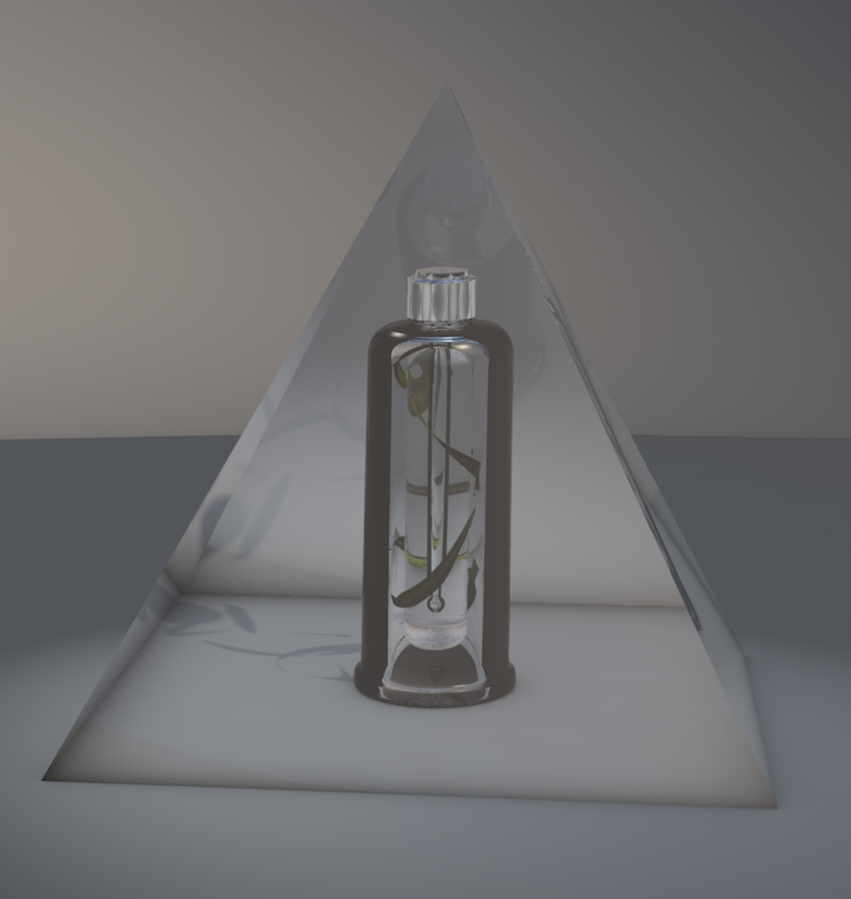
For my final outcome, I created four advertisement campaigns for the new packaging and product design done, all done on cinema 4D. The images will be printed on A2 metallic paper to physically create the iridescent feel. By carefully choosing a the correct medium and size, the visuals will pop out more. 

Working with a new programme for my FMP was a risk I was willing to take. Several adjustments were done on the programme that changed the final visuals entirely. I was working in a whole different world. The texture and lighting used was reflected perfectly, expressing the three main “natural” colours - blue, green and white. 

In evaluation, I believe i have reached the brief and created professional work. Looking back at all the work I have done in the past three years, I kept on writing that I struggle with finalising my idea and experiment completely different visuals until I move into development. This is the first time I feel that I was completely on track from start to finish with a visual I had in mind.Working on live briefs with a final visual set and an idea to explore, I managed to work better. 

Creating this project was a huge step within my creative career, I felt that I have a clear vision on what type of work I want to create and which field to work in. 

The only thing I would change is some of the compositions, I could’ve included more elements is they were in landscape mode, but since these are A2 portraits, there isn’t much space. For the final show, I might take one of the images and present my strongest visuals.

Advertisement & Composition

The final stage of my project is presenting my work in level with industry standard. I will be creating visuals for the new packaging and product campaign. Since I have changed the brands personality from wise to sage, I need to see campings with a sage personality and understand their composition and colour scheme of campaign visuals. The examples include Coca-Cola and Dove soap. Dove leans towards simple background with reflections and coca cola is a bit more playful with the spotlights shining the colour scheme of the brand.  

The previous examples show a simple composition when I want to be a bit more playful and include the packaging trends. I looked at campaign visuals relating to my product to get an idea of which approach to choose.

I was originally going to render my products in Cinema 4D and then use photoshop to do the rest but that would be flat. I wanted to challenge myself and just have everything done in Cinema 4D and play around with lighting to create exciting visuals. I might as well go down the harder route and create something more realistic as I was no longer going to 3D print the finished pieces. I decided to go with the iridescent trend as its already in packaging, I can just expand on that rather than bringing in a new element. 

Keeping that in mind, I need to come up with four images to present. I knew I wanted to have two showing the product and packing and two of the product itself. I sketched out different compositions of what can go where and finally made my final choices. In terms of naming the brand - due to copyright - I cannot use “BIOEFFECTS” hence I came up with several names. I wanted to stick to the company’s values and bring in the new visuals in the name to follow the new brand personality shift. The name of the brand is “Glacier Glow” with a logo of GG. The words “rejuvenating elixir” will be written to emphasis what the product is. Originally it was called EGF cellular activating serum which is too medical for the new approach.

img015.jpg

Developing Products & Packaging Design

Screen Shot 2019-05-03 at 16.13.53.png

By having the opportunity to physically hold and pick apart the issue of the design, it made the development easier. I managed to resize both packaging and product. My product was 20% short and 10% wider. I wanted to create something that has grip, not always have the fear it will slide from my hand. There is no texture but the new shape fit perfectly in someones hand, not too big nor small.

Since the shape and length changed, seven floating leaves weren’t good. I wanted to experiment with different ways of how the leaf could interact with the design in a realistic way. The barely leaf is quite long, I needed to keep that in mind. When I was rendering the images, one of the leaves got stuck within the frosted glass, creating a blur on the leaf texture. This misplacement created a visual that was mysterious - it was the one thing I was missing.

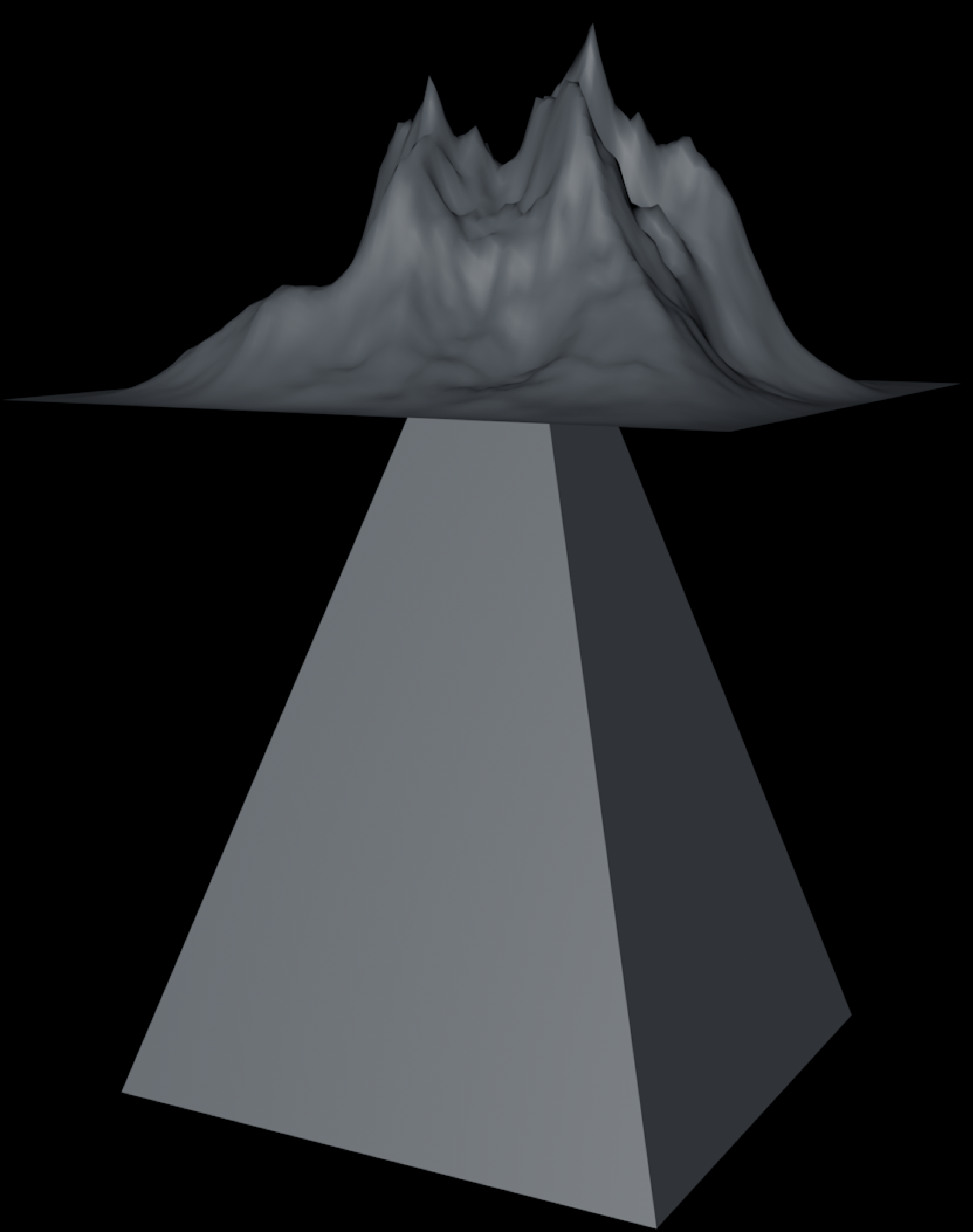
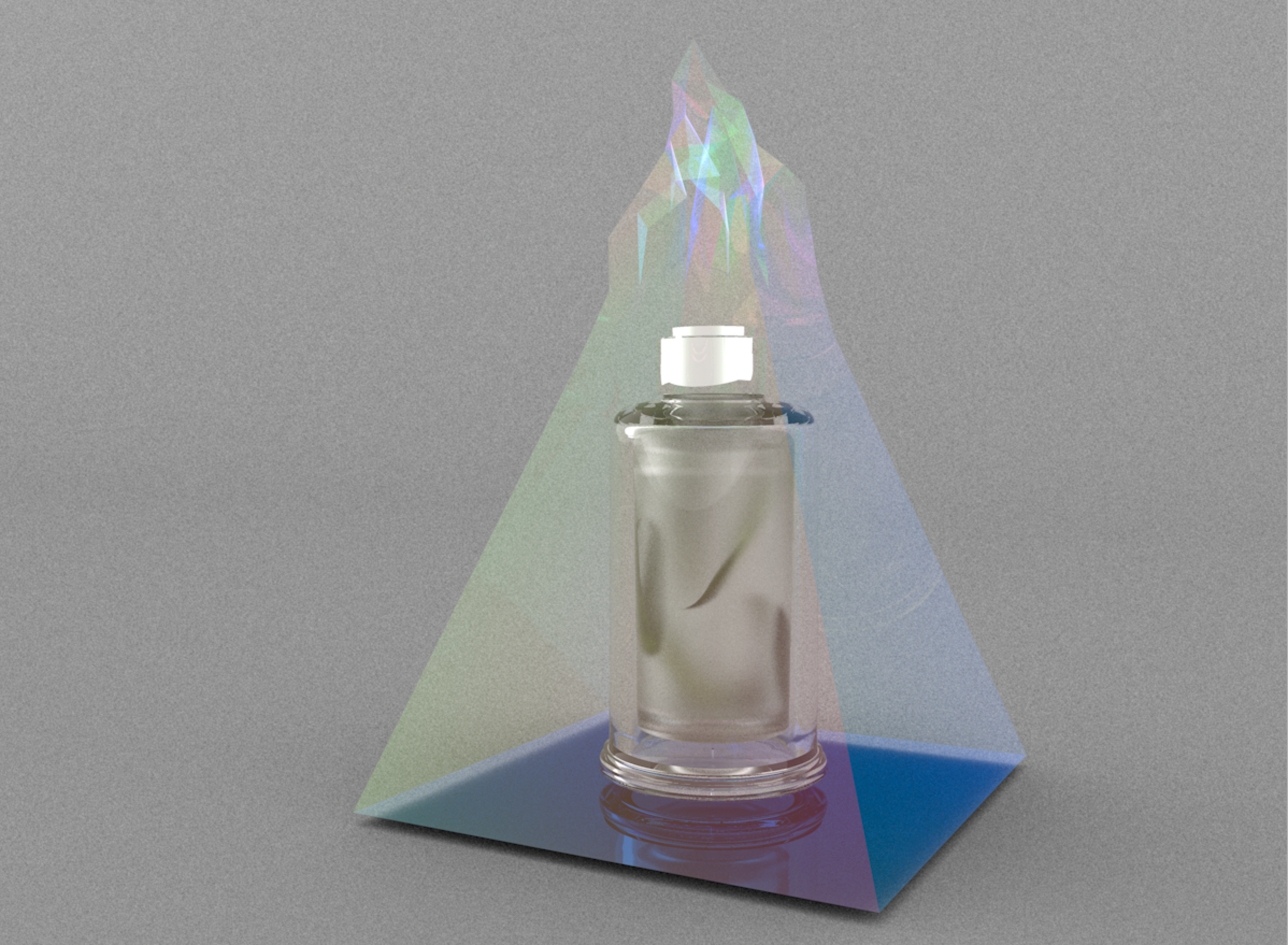
As for the packaging, I felt like the landscape was too much when I needed something more subtle. I took the pyramid into the the sculpting mode in cinema 4d and played around with the tools to create the mountain top. All I had left was changing a couple of lights and fixing the noise and I’m done. 

Screen Shot 2019-05-08 at 09.05.39.png

3d Printing Design

I knew my outcome would be consist of campaign posters, however I wanted to try and 3D print my object as it would be interesting to physically see my design come to life. The bottle I created is a complex design for 3D printers to ‘render’ as its made of glass and the physics of the printer wont allow printing two bottles inside each other without collapsing. The only way to get this perfect replica of my bottle was to hand it over to the professional who will physically sand and polish the prints to create a glass like finish. 

After printing the bottle, a lot of issues flagged up. The bottle was physically to big, it looked more like a perfume bottle than a serum, which wasn’t technically right. The head and dropper were incredibly tiny compared to what the right sizes should be. This is the tricky part in 3D designing, different angles give a different look, you cannot physically look at two at the same time like in the real world.

The 3d printer messed up my packaging design but they were just for trial and error. In order to get the transparent look, I would need to vacuum suction the 3d print. After two trials, the 3d print collapsed. The measurements were quite small as well compared to the bottle.

After seeing the final prints, I knew if I wanted to present these on the show, they would be done by professionals. 

Experimenting Products & Packaging Design

When it came to designing, I had to keep all the previous research in mind. I sketched out how the product and packing currently is with its issues and changes I would like to make. Elements I wanted to visually present were the concepts that were crucial to the company aesthetic. I knew I had to incorporate the Icelandic landscape of mountains, the barley leaf and the wonders of the serum.

After sketching out different alternatives for different parts, I finalised two options for the bottle and three options for the packaging. I had to keep in mind the materials used in order not to spend much money on it.

Cinema 4D

In order to create a 3D mockup, I had to learn a new software called cinema 4d. The more I started to work on the programme, the more my design slightly shifted. Not to get overwhelmed with the programme, I created the basic shapes of bottle and played around with different materials and textures to create a realistic visual and understand the interface. 

After getting the basis down, I started to play around with lighting to see how the bottles transparency reflects and changed some of the textures to create a realistic visual. 

I wanted to experiment different materials for the head of the dropper, playing with chrome textures. I originally tested out a green chrome however it became too much when I added the leaves inside the bottle, it overwhelmed the design.

Finally I managed to finish my first final render of how my product will look like. I originally wanted both bottles to be clear however after testing different textures of frosted glass, it gave a better representation of the product. Since this serum is extremely amazing, its almost sacred. With the frosted visual, it makes you wonder whats inside.

I created the basic pyramid shape that represents the mountains and volcanos of Iceland and placed my product inside to see how it would look like. I tested out a couple of textures to see which one would be aesthetically pleasing. I knew I wanted to incorporate one of the trends into my packaging and I went with the holographic iridescent visual.

The top of the packaging was simple, there wasn’t much graphics on the actual packaging. I was heading towards a minimalistic visual - something the brand visually presents, but with a twist. I layered the pyramid with a landscape and played with different looks in order not to go extreme.

Brand Personality vs. Imagery

Brand Personality vs. Imagery

Brand Identity is the voice you give about the product. Brand Image is what is heard (Bose, 2013). By bringing in the old and new brand personality and the current brands identification, the proposed visual elements for the packing and product design includes - but not limited to: greenhouses, laboratory, and Iceland nature in addition to luxury, simple, and pure. I want to create a design that works together with the packing and the product that reflects the brands vision with its new personality. 

In order to create a visual appropriate for the brands vision, several mini moodboards will be done to show visual research within each section including existing products or packing design.

Greenhouses

There was an earthy feel with the existing products design. There was a lot of green and brown with different textures; giving an organic feel. There were some colours flowing, mostly warm tones. Most of the products reflecting the “greenhouse” theme were oils, body care like soaps and masks and cannabis products. This theme wasn’t the considerable approach within product and packing design market.

Laboratory

This theme reflects a clean visual, consisting of white and glass with a bit of pastel/cool colours.The existing products reflecting the “Laboratory” theme were makeup, skincare, and mostly hygienic products. It gave a “rescue” feeling, something you need to become better. Some feeling as medication.

Iceland nature 

There were no products found that were inspired by Iceland nature. The cool colour scheme could influence the design, textures in the images could enhance the packing and the smoky visuals could inspire the campaigns or final mockups.

Luxurious and simple

Before designing my products, I wanted to have an insight of what the current modern Icelandic design looks like. They seem very simplistic, modernistic, futuristic, and full with abstract lines.

Packaging Designer Pavla Chuykina creating the look of ‘Iceberg Gin’. The way she incorporated the iceberg was very interesting and made think about adding a key visual with the product to make it stand out of the rest.

Skincare packing in 2019

Packaging Trends for Skincare 2019

In today’s market ‘trend’ is to create packing that combines sustainability with luxury. Packaging and product work together and fulfil individual expectations without any extra costs. We currently live in the digital era, where everything is done online; an increase in social media and online shopping is seen. To do well in this ‘digital’ world, there has to be that wow factor when the customer unwraps the product. When purchasing an item, the packaging is the first thing the customer sees.

Beauty product manufacturers suggest consumers look for luxury and glamour in  packaging when buying skincare and cosmetics

(Interpack.com, 2019). Nevertheless, packaging should also be multi-functional and sustainable - keeping in mind lost cost in term of industry production.

By anticipating trends, designers can work and shape the future look of the new and inspiring product and packing design. In 2019, there are 10 packing design trends to keep in mind:

  1. Minimalism that lets colour shine

  2. Bright gradients

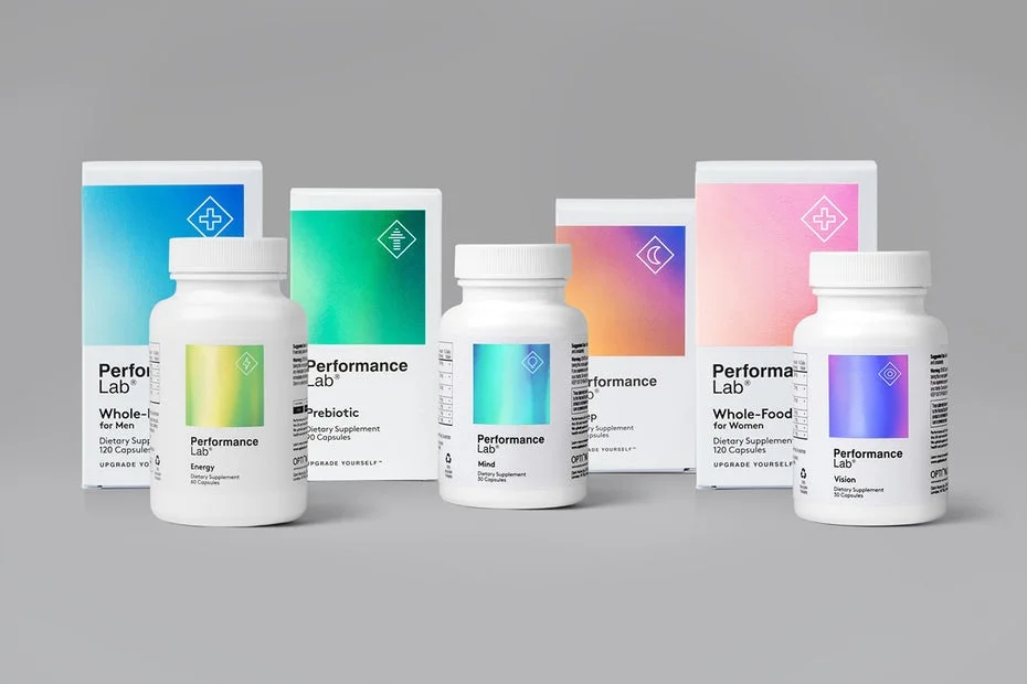
  3. Holographic

  4. Nude palettes

  5. Flat illustration

  6. Vintage-inspired packaging

  7. Black and white packaging

  8. Atypical packaging design

  9. 8-bit packaging design

  10. Plastic free packaging

I will only explore a couple of these 10 trends to focus my research and visuals.

Minimalism

By having a simple design, consumers can make intuitive decisions. With minimalistic design, the substance of the object is exposed; colour and typography shines through making it impactful and guaranteed to stand out.

Bright gradient

The blending of colour creates a fresh look for brands, resulting in revitalising and unique look. Since its the Digital era, this style looks well on digital formats. Brands like Apple and Microsoft have embraced the gradient style from 2016.

Holographic 

Foil effect creates a flair to any packaging or product. This innovative style create depth through the colour changing when lights hits it, catching customers eyes. Other than standing out, this style adds elegance and value to a product.

Nude palettes

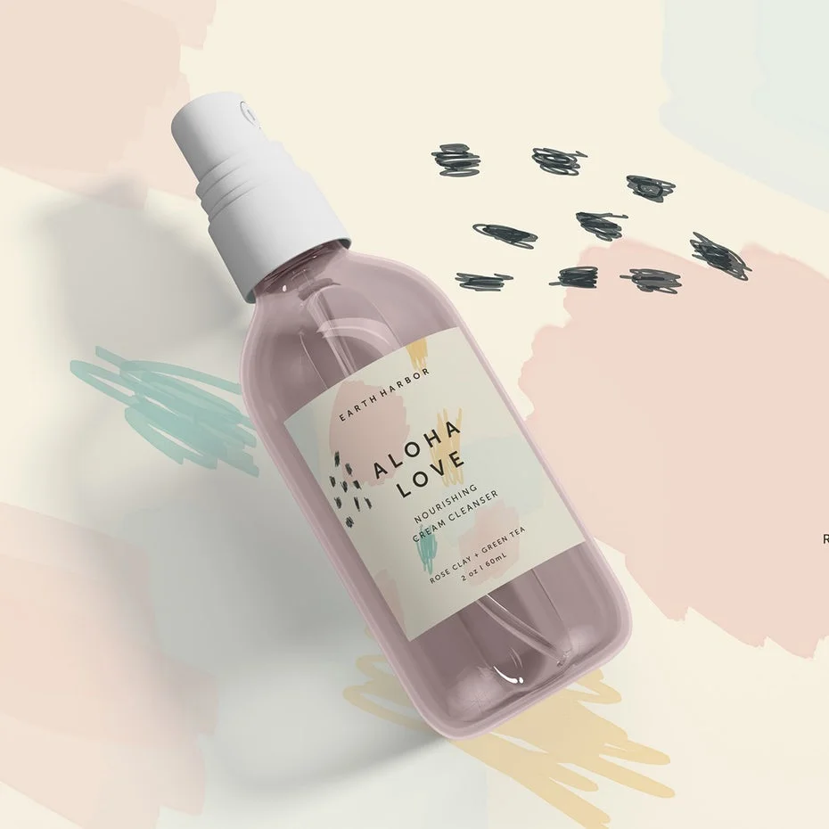
Neutrals pastels are coming back for feminine and calming packaging design. It falls under a softer side compared to the previous two examples. Customers are eased rather than rushed when looking at the labels.

Flat illustration

In 1920 the Swiss Style bloomed with graphic design until mid 20th century. This style focuses on simple design, colour, typography and the overall minimalist approach. The design strips away three dimensional effects, wrapping itself around the product. This approach creates harmony of functionality and aesthetics.

Black and white packaging

Restricting the designer with a colour palette of black and white might seem alarming but it creates powerful and incredibly versatile dialogue.  This direction creates dynamic design impossible to ignore. It is clean, simple and it balances itself out in a satisfying way. On the other hand it can create complexity while maintaining the same minimalistic traits.

References

AKGraphics | Graphic Designers Ireland. (2018). Skincare Packaging Design Trends - AKGraphics | Graphic Designers Ireland. [online] Available at: https://www.akgraphics.ie/design/skincare-packaging-design-trends/ [Accessed 16 Apr. 2019].

Bose, S. (2013). Brand identity, brand personality & brand image. [online] Slideshare.net. Available at: https://www.slideshare.net/SunnyBose/brand-identity-brand-personality-brand-image [Accessed 10 Apr. 2019].

Lupus, M. (2019). 9 inspiring packaging design trends for 2019 - 99designs. [online] 99designs. Available at: https://99designs.co.uk/blog/trends/packaging-design-trends-2019/ [Accessed 17 Apr. 2019].

Interpack.com. (2019). Packaging trends for cosmetics 2019: Lupus, M. (2019). 9 inspiring packaging design trends for 2019 - 99designs. [online] 99designs. Available at: https://99designs.co.uk/blog/trends/packaging-design-trends-2019/ [Accessed 16 Apr. 2019].

Sustainability combined with luxury. [online] Available at: https://www.interpack.com/cgi-bin/md_interpack/lib/pub/tt.cgi/Packaging_trends_for_cosmetics_2019_Sustainability_combined_with_luxury.html?oid=66950&lang=2&ticket=g_u_e_s_t [Accessed 16 Apr. 2019].

Brand Personality

Brand’s Voice

When it comes to rebranding a product, I have to abide the brands vision, mission and ambition. I should keep in mind the tone of voice, value and position of the brand (high end). Rebranding is a marketing strategy that I will have a new name and design thus creating for the established brand new differentiated identity in the minds of consumers, investors, competitors, and other stakeholders (Marketing MO, 2019).

BIOEFFECT added a layer of value to their products that fulfil beyond  basic physiological human needs. They strive for fulfilling human desires. This cutting edge company must articulate “the science of the skincare”  as well as letting “Icelandic flavour” shin through. 

BIOEFFECT Ambition is to become a leading anti-ageing skin care brand. To do that they will:

  • Innovate and strong R&D

  • Make products designed to address signs of ageing

  • Focus on areas where we can make a difference for consumers

  • Building brand awareness through methodical and consistent efforts

  • Leveraging our biotech expertise to refine our powerful formulas

  • Staying true to our identity and our roots

Their strategy to create a unique brand position. Most skin care brands in the market claim they work; BIOEFFECT needs credibility. Biotechnology is the most important pillar for BIOEFFECT. The tone is candid. The current brand is:

  • Genuine - honest, respectful and transparent.

  • Trustworthy 

  • Thoughtful

  • Smart - intelligent and logical

  • Simplicity 

For visual style the greenhouses, laboratory, and Iceland nature is key.

Brand Personality

Brand personality is a set of human characteristics that assign a brand name. It can be used to relate with the consumer, increasing specific consumer segments that they enjoy. Swiss psychologist Carl Jung created the theory that humans have the tendency to use symbolism to understand concepts - also known as the Archetypes. There are 12 brand archetypes which are important in understanding the brand personality. Each archetype have certain values, attitudes, behaviours and characteristics. In rebranding, the brand personality shifts from one to another to create a new visual identity. When creating visuals, I should not confuse the consumers.

Usually in brand personality, there are common traits that propose a ‘main type’:

  • Excitement: carefree, spirited, and youthful

  • Sincerity: kindness, thoughtfulness, and an orientation toward family values

  • Ruggedness: rough, tough, outdoorsy, and athletic

  • Competence: successful, accomplished and influential, highlighted by leadership

  • Sophistication: elegant, prestigious, and sometimes even pretentious

Currently BIOEFFECT can fall under competence, as for the first wheel its wise.  There are two ways I can take this brand, either Sophistication as it is a high end brand or sincerity or according to the first wheel its friendly. Looking at the 12 archetypes, focusing on visuals, I will make a small move within the “Yearn for paradise” from Sage to innocent. 

The Sage

  • Goal: To help the world gain wisdom and insight

  • Traits: Knowledgeable, trusted source of information, wisdom and intelligence, thoughtful, analytical, mentor, guru, advisor

  • Drawback: Could be overly contemplative or too opinionated 

  • Marketing niche: Help people to better understand the world, provide practical information and analysis

  • Example: BBC, PBS, Google, Philips 

The brand could give you warm feelings however get are far off fantasy world like Disney. “Sage commands respect by illustrating brilliance.” This is seen within the academic environment, making since as one of the key aspects of BIOEFFECTS is their extensive research that lead to a revolutionary biotechnology. 

The Innocent

  • Goal: To be happy

  • Traits: Strives to be good, is pure, young, optimistic, simple, moral, romantic, loyal

  • Drawback: Could be naïve or boring

  • Marketing niche: Companies with strong values, seen as trustworthy, reliable and honest, associated with morality, good virtues, simplicity, can be nostalgic

  • Example: Dove soap, Coca-Cola, Cottonelle bathroom tissue

The brand will never guilt you or convince you excessively, they will charm you with something more powerful. By shifting BIOEFFECTS personality’s visuals, the  strong values of the brand will shine with the product visuals. It also follows the current brand personality as BIOEFFECTS never forces its consumers with lies to sell their product, they want them to see the actual results through research and case studies done.

Reference:

Cobizmag.com. (2019). The 12 brand archetypes – Which is yours?. [online] Available at: http://www.cobizmag.com/Business-Insights/The-12-brand-archetypes--Which-is-yours/ [Accessed 14 Apr. 2019].

Eiðsdóttir, H. (2015). Effective marketing and the importance of branding policy. [online] Old.sjavarutvegsradstefnan.is. Available at: http://www.old.sjavarutvegsradstefnan.is/files/Helga.pdf [Accessed 10 Apr. 2019].

Gm.bnoinc.com. (2019). Brand IDENTITY vs. Brand IMAGE – What is Said vs. What is Heard. [online] Available at: http://gm.bnoinc.com/brand-identity-vs-brand-image-what-is-said-vs-what-is-heard/ [Accessed 10 Apr. 2019].

Marketing MO. (2019). Rebranding - How to Rebrand a Company, Product or Service Effectively | Marketing MO - A Comprehensive Brand Strategy Toolkit. [online] Available at: http://www.marketingmo.com/strategic-planning/rebranding-rebrand-a-company-product-or-service/ [Accessed 10 Apr. 2019].

Lim, S. (2019). Why Some Brands Are More Attractive Than Others. [online] Investopedia. Available at: https://www.investopedia.com/terms/b/brand-personality.asp [Accessed 10 Apr. 2019].

Skaggs Creative. (2019). BIOEFFECT - Skaggs Creative. [online] Available at: https://skaggscreative.com/project/bioeffect/ [Accessed 10 Apr. 2019].

Thehartford.com. (2019). The 12 Brand Archetypes. [online] Available at: https://www.thehartford.com/business-playbook/in-depth/choosing-brand-archetype [Accessed 14 Apr. 2019]. 

Bioeffects - Current Package Challenges

egf_packshot_3_600x600.jpg

For my final major project, I wanted to create work within the advertising area. I decided to rebranding an existing product from Bioeffects - the EGF Serum. BIOEFFECT is a skincare brand founded by three scientists who spent ten years of research bioengineer a plant-based human replica of EGF (Epidermal Growth Factor) in barley. The brands mission is to “restore and maintain the skin’s natural youthfulness and vitality” using their pure ingredients. The active ingredient within the serums is EGF, derived in barley plants which develop in volcanic pumice and watered from Icelandic spring water. By rebranding the product it will create a new look as well as exposure by attracting a new target segment - this generation.

Current Package's Challenges

  • Position towards limited target segment

  • Lacks approachability by masses

  • Focus on only one values proposition: medical and pharmaceutical element

  • Disregards the vanity element

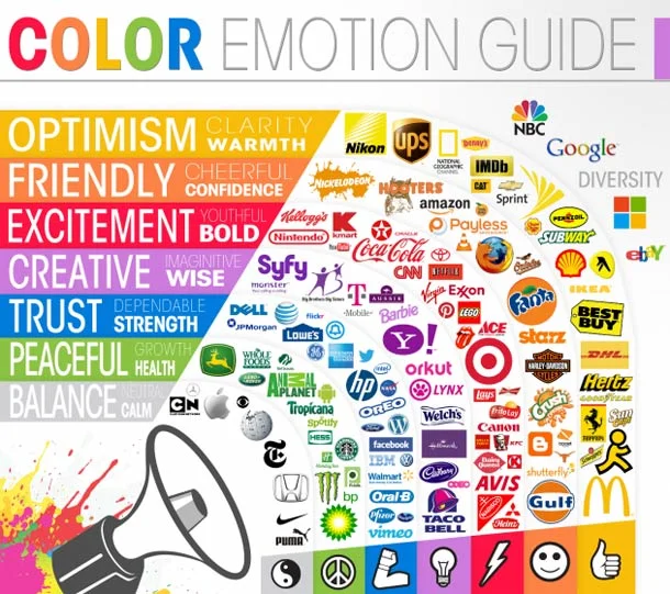
Colour is a very powerful tool when it comes to branding a product as it conveys a message. According to the “Maryland study” done at University of Loyola, Brands are typically recognised 80% more with their colour (Dallmeier, 2016). 60% of the time, people will either be attracted or not based on the colour of the message. Colour influences your buying decisions.

When it comes to skin care products, there is a certain colour scheme that represents the concept of “natural”. Bioeffect stress the fact that they use “pure ingredients” with their products that are derived from a plant. Biologist Lorraine Dallmeier looked at “50 Natural Skincare Brands”and found that there are three main colours in their branding were: white, green and blue. There is psychological reasoning behind using such colours. White typically represents purity, simplicity and cleanliness. It is often used in health-related products, in this case, the medical aspect within the Bioeffect’s brand. Green represents serenity, health and freshness creating sense of health and calm. These two colours are the main colours of the brand, it is used within the current packaging and product design. Blue is not used within Bioeffects however it is one of the main colours of Natural skin care brands and it represents dependability and trust.

Color_Emotion_Guide.jpg

Looking at colours and consumers, there are colours that they like and dislike. Women tend to  lean towards blue, purple and green and move away from orange, brown and grey. Men like blue, green and Black and dislike brown, orange and purple.

Bench marking

There are four types of benchmarking:

  1. Strategic Benchmarking

  2. Competitive Benchmarking

  3. Functional Benchmarking

  4. Internal Benchmarking

I will be focusing on competitive benchmarking, in specific to design. I will be comparing Bioeffects product design to other current competitors in the market. I will be closing gaps to make sure the visual improves. In todays market, consumers are frequently seeking ethically labelled, eco-friendly, free from harsh chemicals products (Mordorintelligence.com, 2018).  

Since EGF is an anti ageing product, I researched what are the “best Anti-Aging Serums” that are cult-favorite, editor-approved and loved world wide.

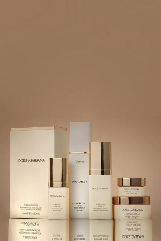
Since Bioeffect is seen as a high end brand sold at Harrods and Net-a-Porter, I will compare it to existing brands at the same level this focusing my research. According to Glamour, these are the best luxury skin products 2018 (Nast, 2018). In relation to anti ageing serums/creams these are the top 4:

In 2019,  these are the top 4 anti ageing serums/creams:

Here are a few serums that have been recognised for their excellence on different platforms. I will use these as visual inspiration for the product design.

Reference:

Allure. Available at: https://www.allure.com/gallery/must-try-beauty-products-bucket-list [Accessed 9 Apr. 2019].

Chadwick, M. (2019). The 36 Most Exciting Beauty Products to Try in 2019. [online] 

Dallmeier, L. (2016). The Meaning of Colours in Natural Skincare Branding. [online] Herb & Hedgerow. Available at: http://www.herbhedgerow.co.uk/the-meaning-of-colours-in-natural-skincare-branding/#ixzz5kIu1bazy [Accessed 6 Apr. 2019].

Mordorintelligence.com. (2018). Organic Skin Care Market Size, Share, Trends, Growth, Forecast (2018-23). [online] Available at: https://www.mordorintelligence.com/industry-reports/organic-skin-care-market [Accessed 8 Apr. 2019].
Nast, C. (2019). 17 Skin Care Products That Are Worth Every Single Penny. [online] Glamour. Available at: https://www.glamour.com/gallery/beauty-awards-skincare-product-winners [Accessed 8 Apr. 2019].

Nast, C. (2018). Skin Care So Good, It’s Worth Every Single Penny. [online] Glamour. Available at: https://www.glamour.com/gallery/best-luxury-skincare-products [Accessed 8 Apr. 2019].

Storm, M. and Adamiyatt, R. (2019). The Best Anti-Aging Products We Swear By. [online] Town & Country. Available at: https://www.townandcountrymag.com/style/beauty-products/g624/top-25-anti-aging-products/ [Accessed 8 Apr. 2019].

Racho, J. (2019). 9 Face Serums That Will Banish Fine Lines and Wrinkles. [online] Dermstore Blog. Available at: https://www.dermstore.com/blog/top_ten/wrinkle-serums-that-actually-work/ [Accessed 8 Apr. 2019].

Silberman, L. and Adamiyatt, R. (2019). The Best Anti-Aging Serums For Any Budget. [online] Town & Country. Available at: https://www.townandcountrymag.com/style/beauty-products/g12823629/best-anti-aging-serums/ [Accessed 8 Apr. 2019].

The Good Trade. (2019). 17 Best Natural & Organic Skincare Brands For That Perfect Pure Glow. [online] Available at: https://www.thegoodtrade.com/features/natural-and-organic-skincare-brands [Accessed 9 Apr. 2019].

Children's Book Cover

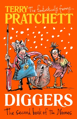
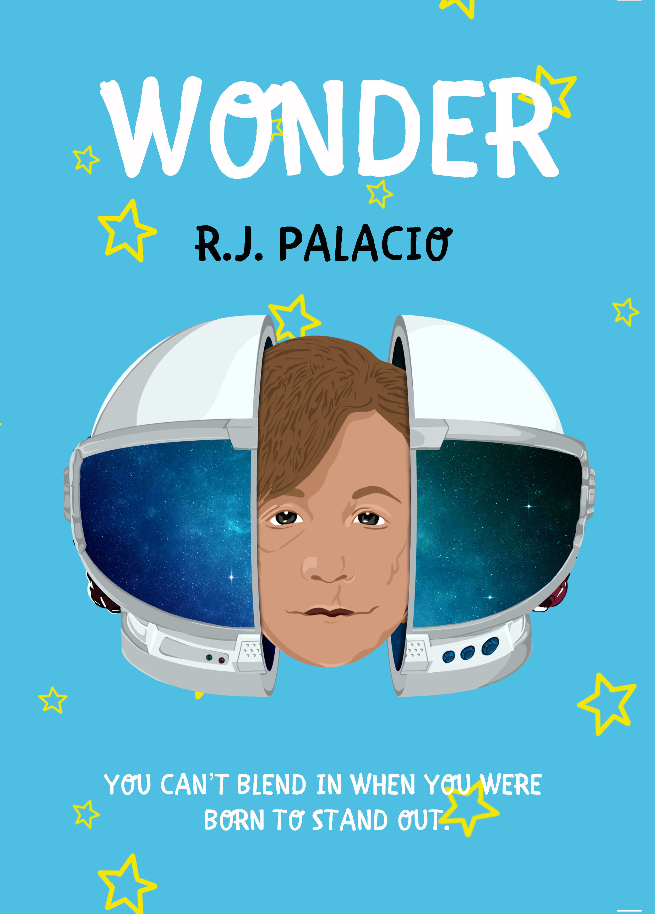
When given the penguin brief, I decided to choose the children’s book I have read the book as well as seen the movie, hence having a full understanding of the story. When it came to designing the cover, I had a look at the existing covers out there. By doing this, I knew the characteristics of the cover by following a visual and colour scheme. I knew I had to create something both adults and children would want to pick up.

I looked at some of the existing children book covers were done by the illustrators who work for penguin house in order to find a recurring style that has been successful. Bold colours, moving towards cool colour have been used several times. Illustrations used stick to blocky objects joined to create a face and body.

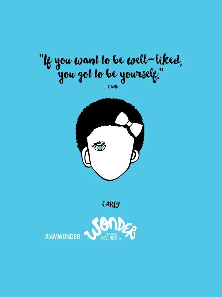
After getting my basic research done, I need to see other illustrations done for wonder. The blue background with the face and one eye showing was crucial in the design and had to be done as it is the feature of the book.

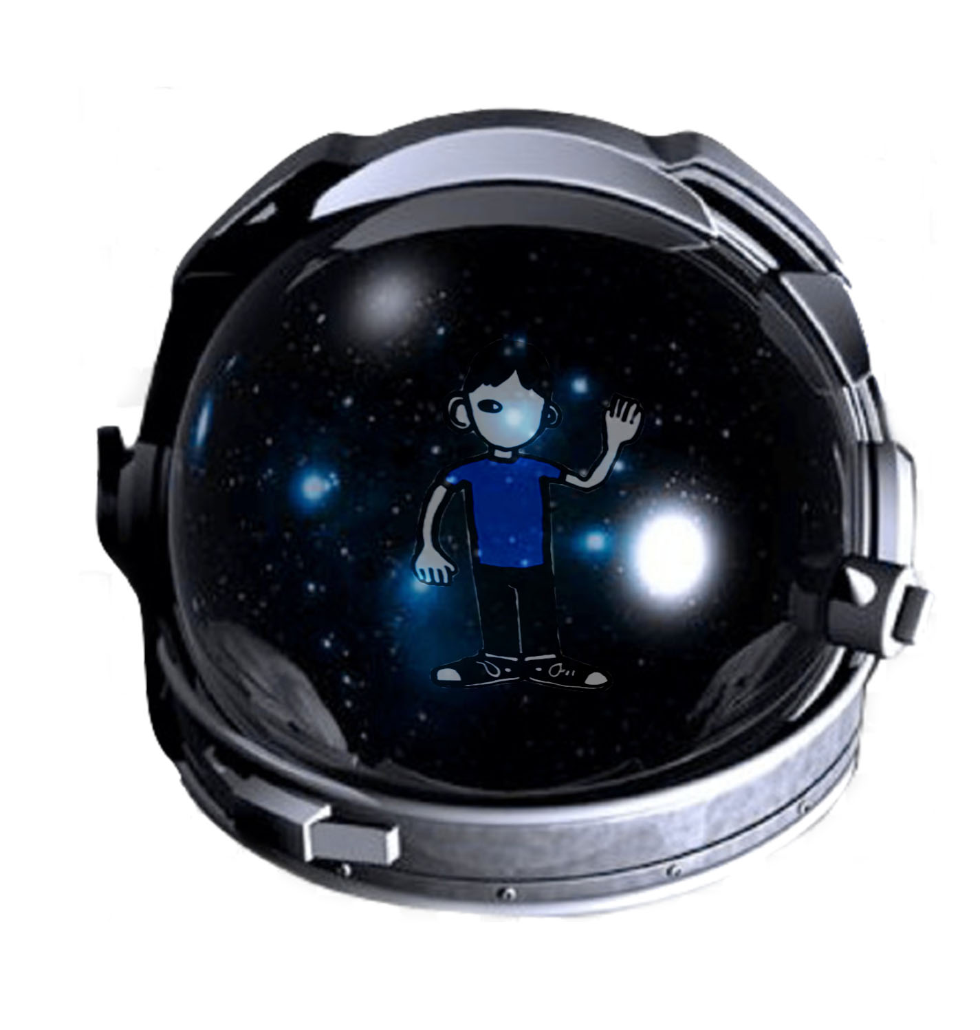
I started to sketch out how the cover image could look like, experimenting with the iconic space helmet and the bare face. I did play around with the statement required to be on the cover but didn’t like it as much as it became too distracting.

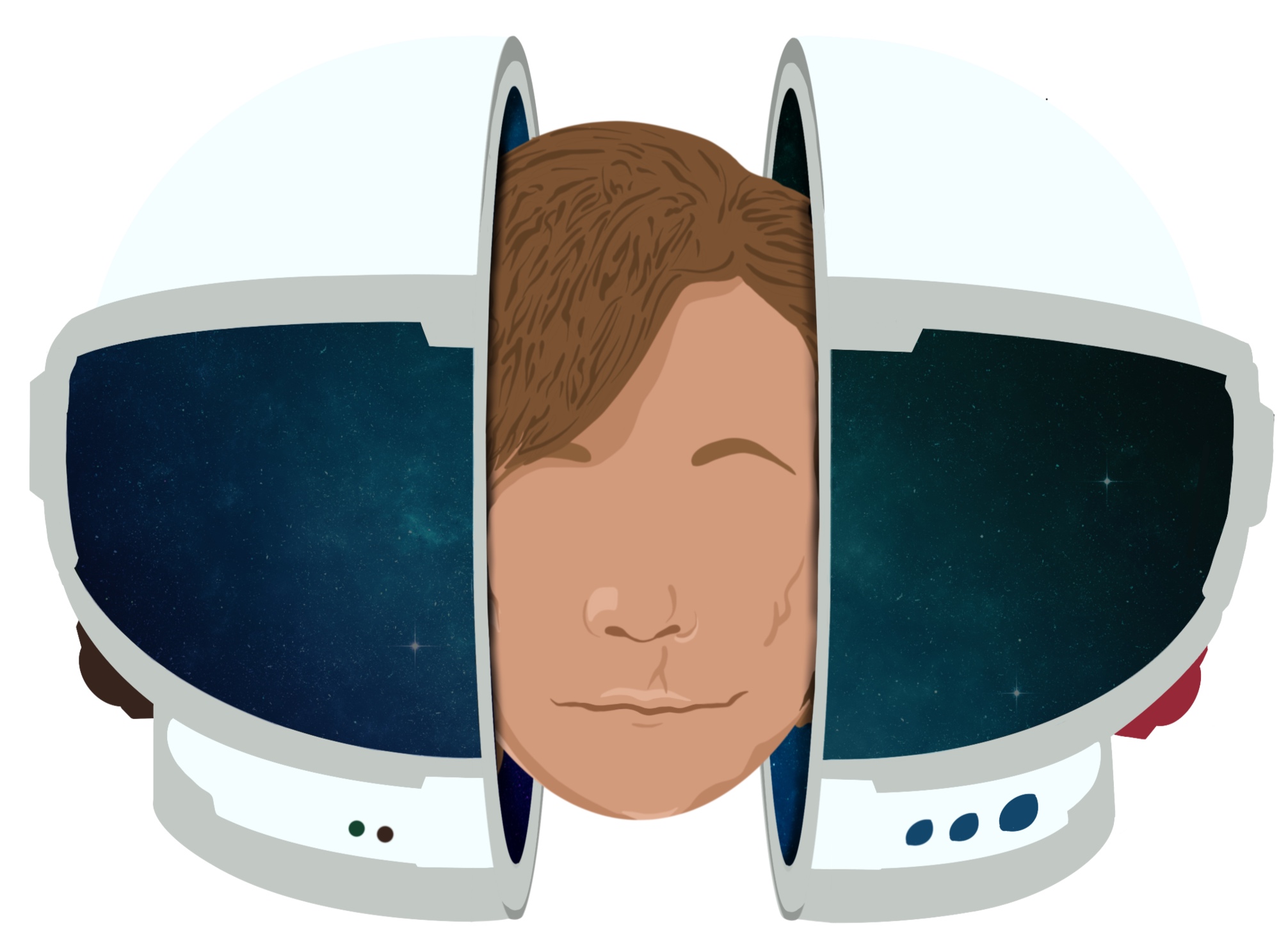
For the cover, I illustrated the face of Auggie as I based it over the fact that some of the book covers include the poster of the film. I played with different variations by taking away some facial features. I had also created different variations of the helmet - in terms of details - to see how it will look like. I played around with the space reflection and within the opening of the helmet to show how Auggie was in his own space.

I played around with different fonts to see which fits the aesthetic of the book most.

COVER1 copy.jpg

After the crit, most of the feedback suggested taking out the head as it takes away from the mystery of how Auggie describes himself. By having his face on the front cover, it takes away the imagination. My peers suggested to take away some facial features and leave the scars to see how it would look like.  

I felt like the face does indeed have a lot of power on the cover when it should be simple. When there's a lot happening on the cover, it doesn’t work and become too distracting. I want to express the simplicity of a young boy living his childhood. I took away the head and split the space helmet into both sides of the cover. This gives more details to the helmet and also makes the reader want to hold it up to see what's on the other side. 

I decided to stick with the space reflection as the black was too much and not as aesthetically pleasing as the space reflection.

Traces

After given several tutor briefs, I choose traces. It asked us to explore the notion of ‘the trace’ through research, personal reflection, and visual experimentation. Starting off I used the quote given by Walter Benjamin ‘To live is to leave traces’ to make me think what a trace could be.

According to Derrida, the concept of ‘trace’ is the most minimal form of life. My insight on what a trace could be is a memory, something you leave on someone. After looking at the brain and how it works, memory is not stored in one part of the brain, but distributed throughout the cortex. Memory storage is an ongoing process reclassification resulting in continuous changes and parallel processing information in our brains.

I started researching what a trace is within different cultures. In the Arab Culture, there is a saying “الأرواح جنود مجندة“ meaning “The souls are like conscripted soldiers”. There is no one way of looking at this because in the Arabic language one word could mean several things, hence a full saying could translate to many meanings. When souls have entered bodies they may recognise one another from the past and may be on friendly terms or otherwise based on that past experience. It also signifies how good people are inclined towards other good people, and evil people are similarly inclined towards other evil people.

original.jpg

The Japanese culture has a similar belief “The Red Thread of fate”. This myth is that the gods tie an invisible red cord around the little finger of those who are destined to meet one another; similar to the westerns concept of “soulmates”. Those connected are destined lovers, regardless of time, space or circumstances. This cord could stretch and tangle but never break.  

James Eads, a surrealistic impressionist who explores ideas of the soul and human connection. His visual impersonate the concepts of traces.

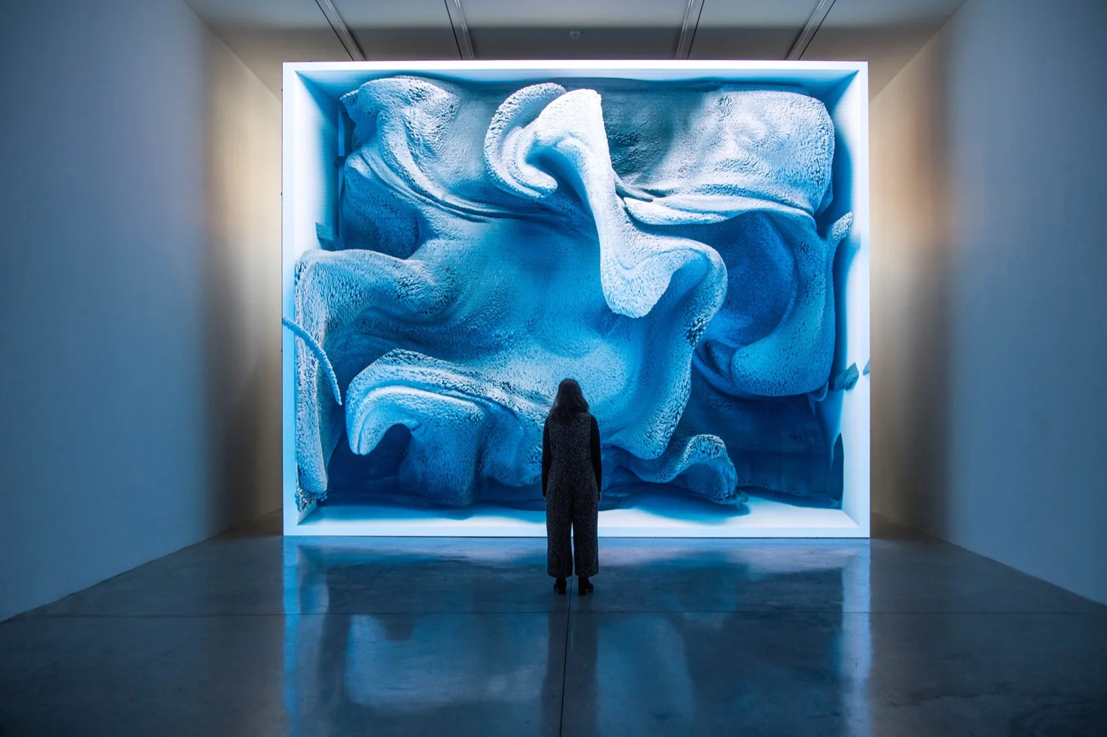
Refik Anadol, Media Artist & Designer, explores the materiality of remembering by offering new insights into the representational possibilities of EEG data collected on the neural mechanisms of cognitive control. 

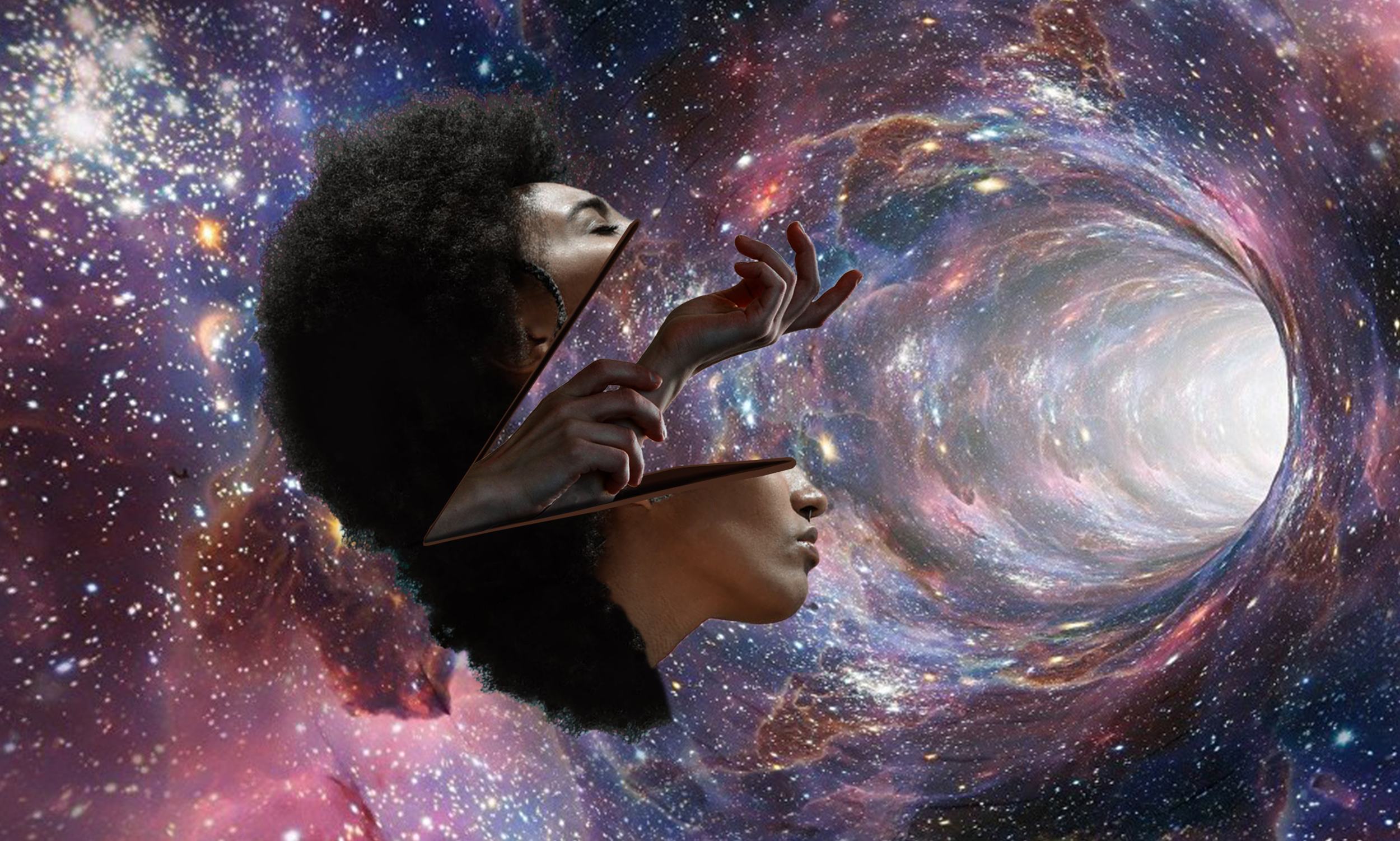
I started to sketch out some of the visuals I might illustrate. I knew I wanted to challenge myself and use photoshop to create “image manipulation”. By incorporated heads, it reflects the concept of the psychology behind the souls and hands reflect the concept of body communication and how this type of communication leave traces on the souls of others.

After finding the appropriate images online, I started to play around with different tools on photoshop to see which visual represents my concept in the best way.

Following the final visuals, I started to experiment with different backgrounds until I found the most appropriate one. I focused my search on space as relates to the concept of Trace.

Depending on visual, I used the different layers and filters to experiment how it would look like. 

To make it more personal, I used an image that a captured memory that became a trace on me and played with it to create a background for my visuals. As a final image, it doesn’t look visually pleasing compared to the space background.

My final outcome created consisted of a series of visuals that represent the concept of trace.