
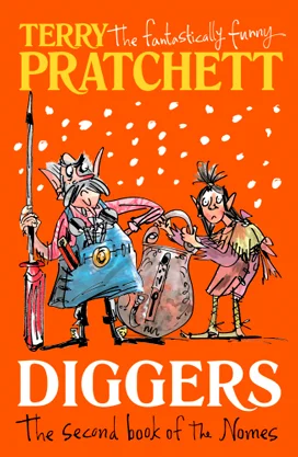
When given the penguin brief, I decided to choose the children’s book I have read the book as well as seen the movie, hence having a full understanding of the story. When it came to designing the cover, I had a look at the existing covers out there. By doing this, I knew the characteristics of the cover by following a visual and colour scheme. I knew I had to create something both adults and children would want to pick up.


I looked at some of the existing children book covers were done by the illustrators who work for penguin house in order to find a recurring style that has been successful. Bold colours, moving towards cool colour have been used several times. Illustrations used stick to blocky objects joined to create a face and body.


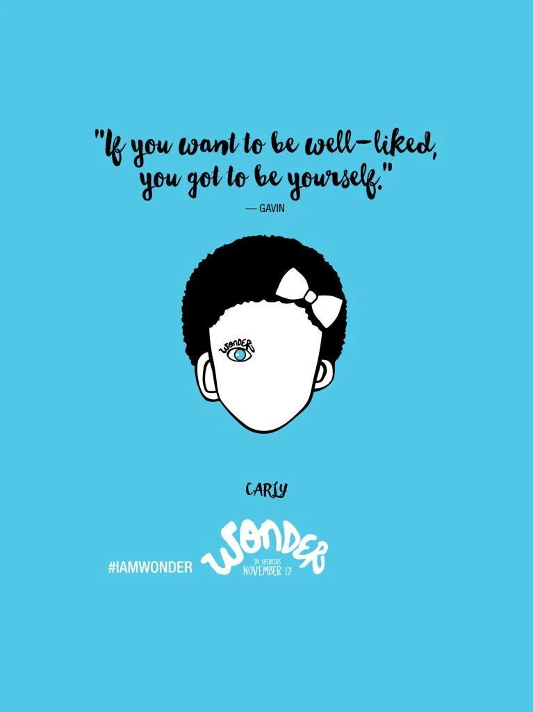


After getting my basic research done, I need to see other illustrations done for wonder. The blue background with the face and one eye showing was crucial in the design and had to be done as it is the feature of the book.
I started to sketch out how the cover image could look like, experimenting with the iconic space helmet and the bare face. I did play around with the statement required to be on the cover but didn’t like it as much as it became too distracting.


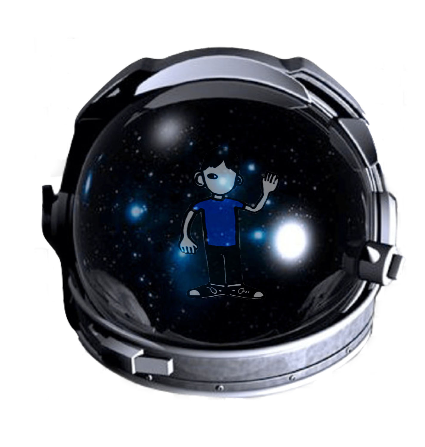


For the cover, I illustrated the face of Auggie as I based it over the fact that some of the book covers include the poster of the film. I played with different variations by taking away some facial features. I had also created different variations of the helmet - in terms of details - to see how it will look like. I played around with the space reflection and within the opening of the helmet to show how Auggie was in his own space.


I played around with different fonts to see which fits the aesthetic of the book most.


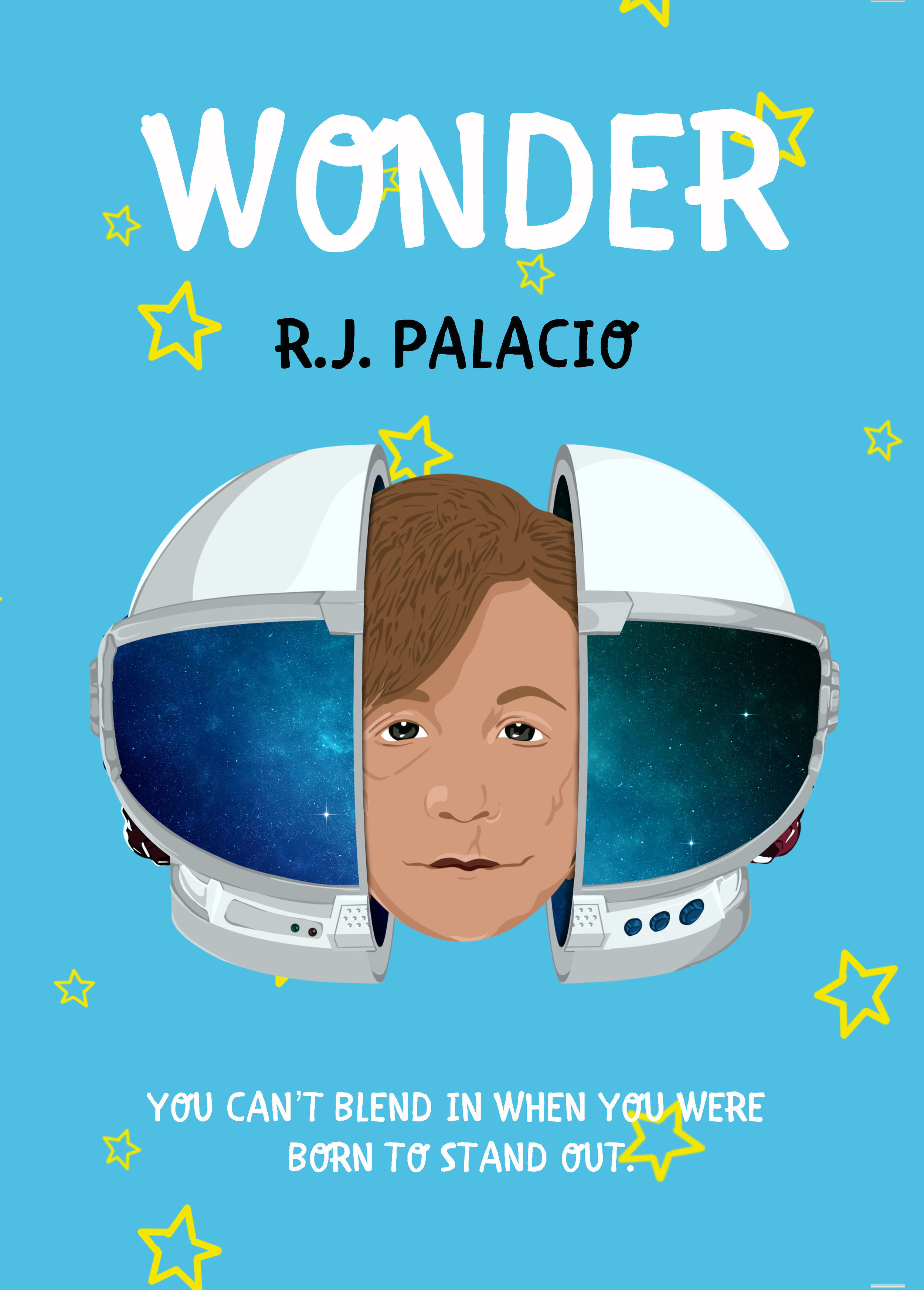


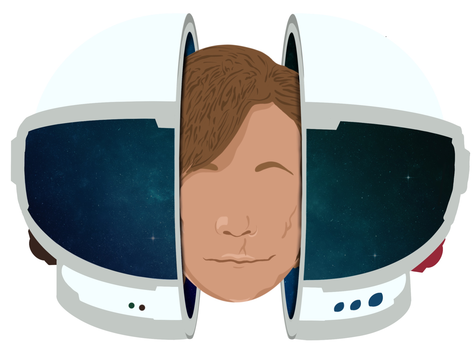
After the crit, most of the feedback suggested taking out the head as it takes away from the mystery of how Auggie describes himself. By having his face on the front cover, it takes away the imagination. My peers suggested to take away some facial features and leave the scars to see how it would look like.
I felt like the face does indeed have a lot of power on the cover when it should be simple. When there's a lot happening on the cover, it doesn’t work and become too distracting. I want to express the simplicity of a young boy living his childhood. I took away the head and split the space helmet into both sides of the cover. This gives more details to the helmet and also makes the reader want to hold it up to see what's on the other side.


I decided to stick with the space reflection as the black was too much and not as aesthetically pleasing as the space reflection.

