
When it came to designing, I had to keep all the previous research in mind. I sketched out how the product and packing currently is with its issues and changes I would like to make. Elements I wanted to visually present were the concepts that were crucial to the company aesthetic. I knew I had to incorporate the Icelandic landscape of mountains, the barley leaf and the wonders of the serum.


After sketching out different alternatives for different parts, I finalised two options for the bottle and three options for the packaging. I had to keep in mind the materials used in order not to spend much money on it.


Cinema 4D
In order to create a 3D mockup, I had to learn a new software called cinema 4d. The more I started to work on the programme, the more my design slightly shifted. Not to get overwhelmed with the programme, I created the basic shapes of bottle and played around with different materials and textures to create a realistic visual and understand the interface.


After getting the basis down, I started to play around with lighting to see how the bottles transparency reflects and changed some of the textures to create a realistic visual.


I wanted to experiment different materials for the head of the dropper, playing with chrome textures. I originally tested out a green chrome however it became too much when I added the leaves inside the bottle, it overwhelmed the design.


Finally I managed to finish my first final render of how my product will look like. I originally wanted both bottles to be clear however after testing different textures of frosted glass, it gave a better representation of the product. Since this serum is extremely amazing, its almost sacred. With the frosted visual, it makes you wonder whats inside.


I created the basic pyramid shape that represents the mountains and volcanos of Iceland and placed my product inside to see how it would look like. I tested out a couple of textures to see which one would be aesthetically pleasing. I knew I wanted to incorporate one of the trends into my packaging and I went with the holographic iridescent visual.
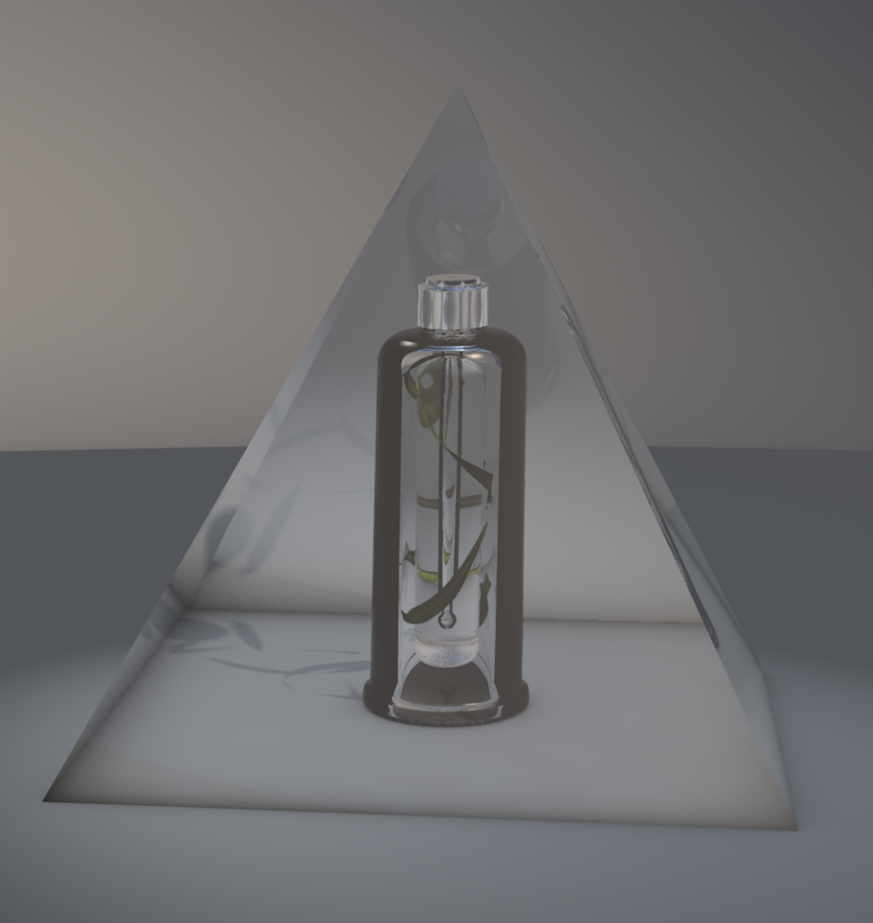


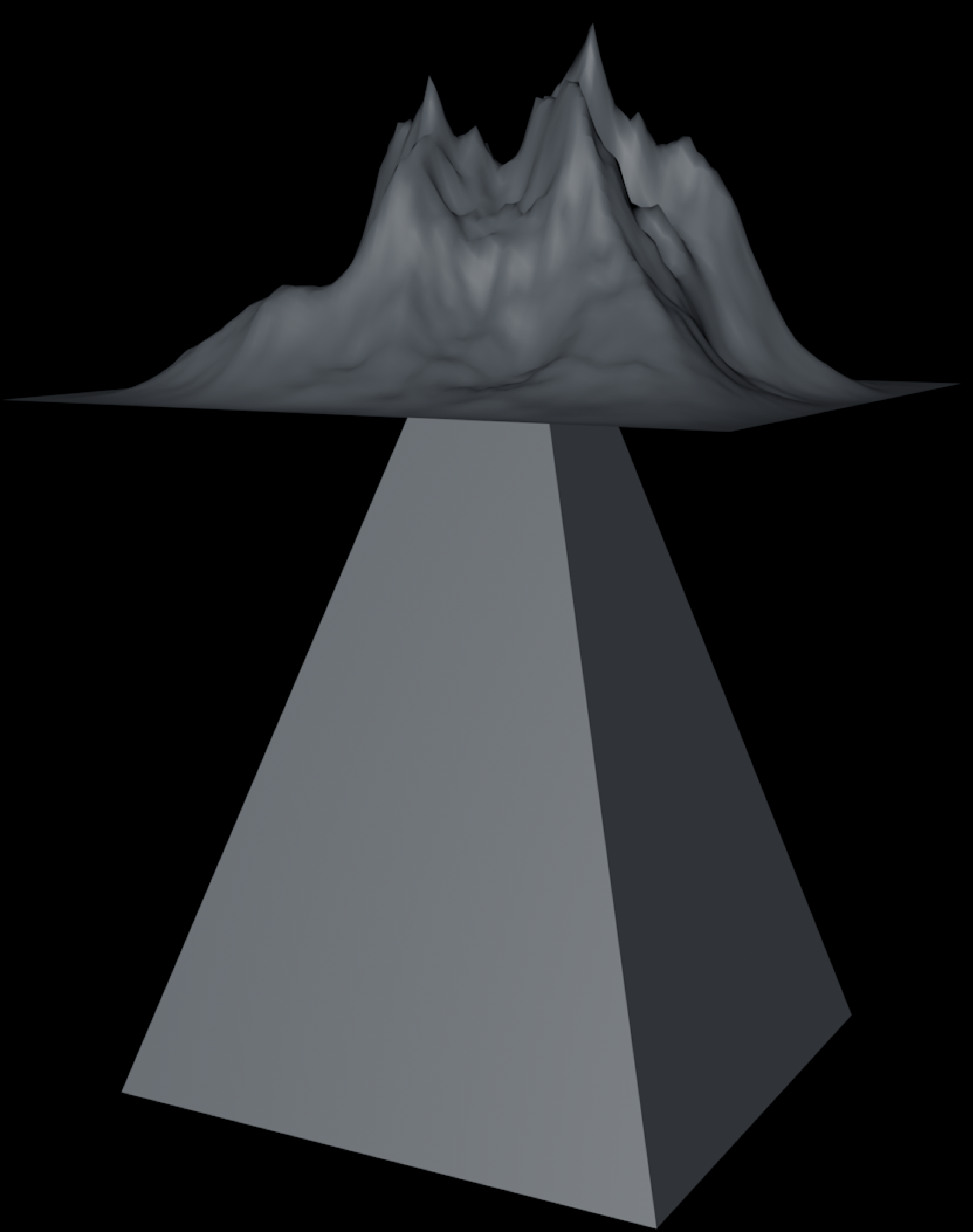


The top of the packaging was simple, there wasn’t much graphics on the actual packaging. I was heading towards a minimalistic visual - something the brand visually presents, but with a twist. I layered the pyramid with a landscape and played with different looks in order not to go extreme.