
Brand Personality vs. Imagery
Brand Identity is the voice you give about the product. Brand Image is what is heard (Bose, 2013). By bringing in the old and new brand personality and the current brands identification, the proposed visual elements for the packing and product design includes - but not limited to: greenhouses, laboratory, and Iceland nature in addition to luxury, simple, and pure. I want to create a design that works together with the packing and the product that reflects the brands vision with its new personality.
In order to create a visual appropriate for the brands vision, several mini moodboards will be done to show visual research within each section including existing products or packing design.
Greenhouses


There was an earthy feel with the existing products design. There was a lot of green and brown with different textures; giving an organic feel. There were some colours flowing, mostly warm tones. Most of the products reflecting the “greenhouse” theme were oils, body care like soaps and masks and cannabis products. This theme wasn’t the considerable approach within product and packing design market.
Laboratory


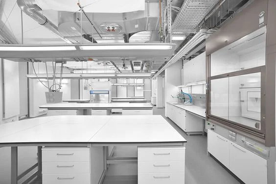


This theme reflects a clean visual, consisting of white and glass with a bit of pastel/cool colours.The existing products reflecting the “Laboratory” theme were makeup, skincare, and mostly hygienic products. It gave a “rescue” feeling, something you need to become better. Some feeling as medication.
Iceland nature


There were no products found that were inspired by Iceland nature. The cool colour scheme could influence the design, textures in the images could enhance the packing and the smoky visuals could inspire the campaigns or final mockups.
Luxurious and simple
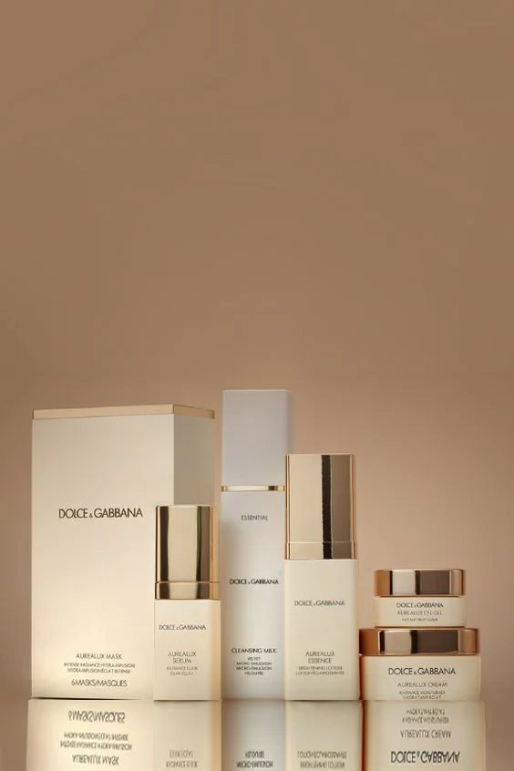


Before designing my products, I wanted to have an insight of what the current modern Icelandic design looks like. They seem very simplistic, modernistic, futuristic, and full with abstract lines.
Packaging Designer Pavla Chuykina creating the look of ‘Iceberg Gin’. The way she incorporated the iceberg was very interesting and made think about adding a key visual with the product to make it stand out of the rest.


